Interaction Design + User Interface
Less clicking, more insight— building a powerful sidebar
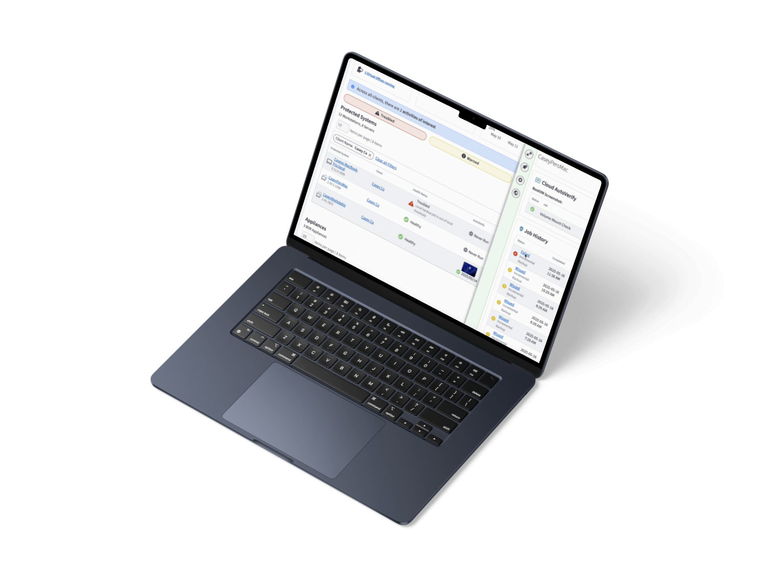
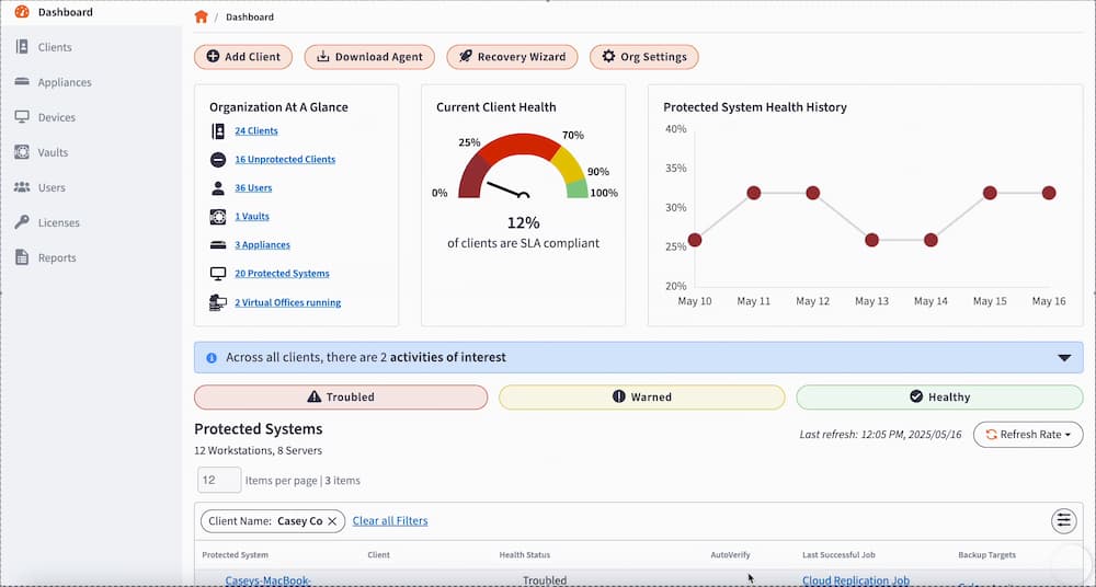
To reduce friction and improve task efficiency, we designed a dynamic sidebar that surfaces the most relevant information and actions into a single view—no extra clicks required. By centralizing context, we gave users the clarity they needed without disrupting their workflow. The result? Faster decision-making, higher adoption, and a more focused experience.
The tl;dr
The interactive sidebar transformed how partner engage with our SaaS platform Dashboard— bringing clarity, speed, and confidence to their daily workflows. By surfacing the right information at the right time, we eliminated unnecessary navigation, boosted engagement, and delivered a smarter, more intuitive experience.
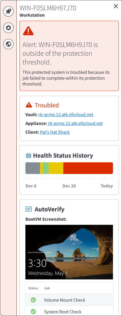
Alert: Provides a quick, detailed summary of why a device may be experiencing issues.
Device Overview: Maps device to vault, appliance, and client.
Health History: a visual overview of a device’s performance and stability over the past 30 days allowing users to quickly identify patterns or recurring problems.
AutoVerify: summarizes the most recent results for the protected system, including key validation checks and a BootVM screenshot to provide visual confirmation of system integrity.
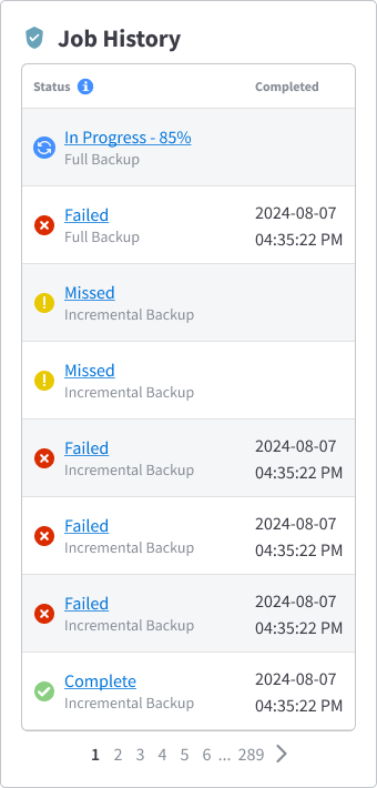
Job History: a clear record of each job’s type, status, and completion timestamp to quickly review recent activity, identify failed or delayed jobs, and ensure that critical processes have completed successfully (item located outside of this frame)
Interaction Design + User Interface
Less clicking, more insight— building a powerful sidebar
To reduce friction and improve task efficiency, we designed a dynamic sidebar that surfaces the most relevant information and actions into a single view—no extra clicks required. By centralizing context, we gave users the clarity they needed without disrupting their workflow. The result? Faster decision-making, higher adoption, and a more focused experience.
The tl;dr
The interactive sidebar transformed how partner engage with our SaaS platform Dashboard— bringing clarity, speed, and confidence to their daily workflows. By surfacing the right information at the right time, we eliminated unnecessary navigation, boosted engagement, and delivered a smarter, more intuitive experience.
Device Overview: Maps device to vault, appliance, and client.
Alert: Provides a quick, detailed summary of why a device may be experiencing issues.
Health History: a visual overview of a device’s performance and stability over the past 30 days allowing users to quickly identify patterns or recurring problems.
AutoVerify: summarizes the most recent results for the protected system, including key validation checks and a BootVM screenshot to provide visual confirmation of system integrity.
Job History: a clear record of each job’s type, status, and completion timestamp to quickly review recent activity, identify failed or delayed jobs, and ensure that critical processes have completed successfully (item located outside of this frame)
Interaction Design + User Interface
Less clicking, more insight— building a powerful sidebar
To reduce friction and improve task efficiency, we designed a dynamic sidebar that surfaces the most relevant information and actions into a single view—no extra clicks required. By centralizing context, we gave users the clarity they needed without disrupting their workflow. The result? Faster decision-making, higher adoption, and a more focused experience.
The tl;dr
The interactive sidebar transformed how partner engage with our SaaS platform Dashboard— bringing clarity, speed, and confidence to their daily workflows. By surfacing the right information at the right time, we eliminated unnecessary navigation, boosted engagement, and delivered a smarter, more intuitive experience.
95%
satisfaction rate
Per our CSAT survey— citing improved clarity, reduced frustration, and better access to information.
80%
increase in activity
Partner engagement with key workflows on our Dashboard, indicating that the sidebar made features more discoverable and easier to act on.
21
hours saved/week
Of page load time— saving entire teams hours of manual clicking, tabbing, and searching each week.
Device Overview: Maps device to vault, appliance, and client.
Alert: Provides a quick, detailed summary of why a device may be experiencing issues.
Health History: a visual overview of a device’s performance and stability over the past 30 days allowing users to quickly identify patterns or recurring problems.
AutoVerify: summarizes the most recent results for the protected system, including key validation checks and a BootVM screenshot to provide visual confirmation of system integrity.
Job History: a clear record of each job’s type, status, and completion timestamp to quickly review recent activity, identify failed or delayed jobs, and ensure that critical processes have completed successfully (item located outside of this frame)