Brittany Nichols | Portfolio
Interaction Design + User interface
Sidebar Feature for Less Clicking, More Insights
UX Designer | July 2023 - April 2024
The Problem
Partners were losing efficiency due to fragmented information scattered across multiple tabs and screens. Without a centralized view, users were forced to context-switch repeatedly, slowing workflows and reducing confidence, especially for power users who needed to act quickly and accurately.
→
Reducing context switching by consolidating key insights into a single, accessible space
→
Surfacing just-in-time information to support faster decision-making
→
Providing shortcuts and next steps to streamline high-frequency workflows
→
Improving clarity and trust by presenting data in a consistent, intuitive format
How do we improve efficiency and surface contextual insights?
To improve efficiency and deliver contextual insights in the moment, we established clear design requirements grounded in user interviews, support data, and workflow mapping. These insights shaped a flexible sidebar pattern validated through usability testing and refined in partnership with engineering—ensuring real-time, high-value information is surfaced without disrupting users’ flow.
Define a sidebar experience that surfaces just-in-time insights
Deliver just-in-time insights, recent activity, and next-step actions directly within the dashboard—reducing navigation friction and improving decision speed.
Address known context gaps
Synthesize insights from user interviews and support data to define the highest-value information and actions to expose in-line.
Support diverse workflows with flexible patterns
Map end-to-end user journeys and establish scalable interaction models through wireframes and prototypes exploring multiple layout options
Ensure clarity, responsiveness, and performance
Validate comprehension and hierarchy through usability testing, and partner with engineering to support responsive behavior and dynamic content loading.
Watch the side bar in action 👇🏼
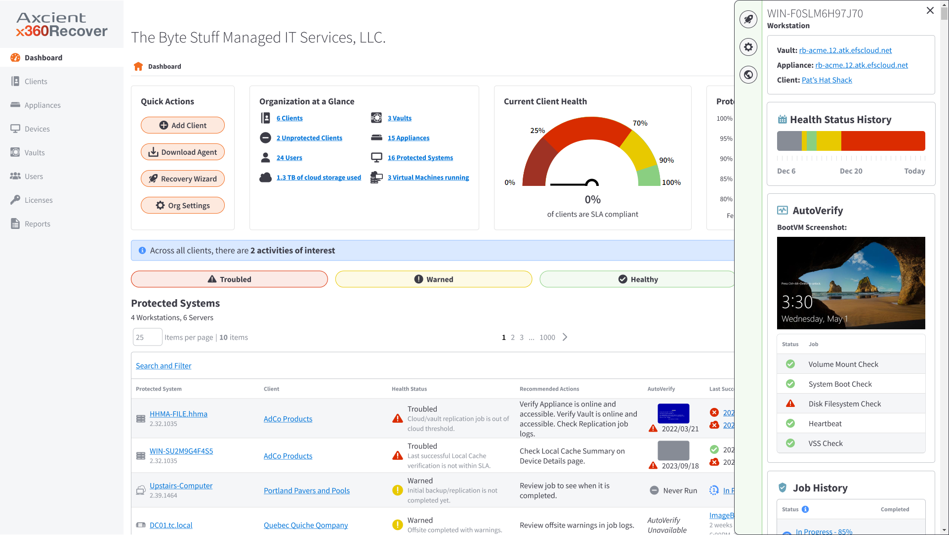
This demo shows how the sidebar surfaces contextual insights and quick actions in one place, helping users work more efficiently without navigating away from their dashboard.
In this example, you’ll see the user on the main Dashboard where they monitor devices. From here they click into a system and check the status of a job. They then check in on another system and read the alert.
Design Breakdown
Our solution consolidates related information and actions into a single, easily accessible view—without overwhelming the interface. We aimed to reduce context switching, improve task efficiency, and enhance overall usability, especially for users who rely on speed and focus in high-stakes workflows.
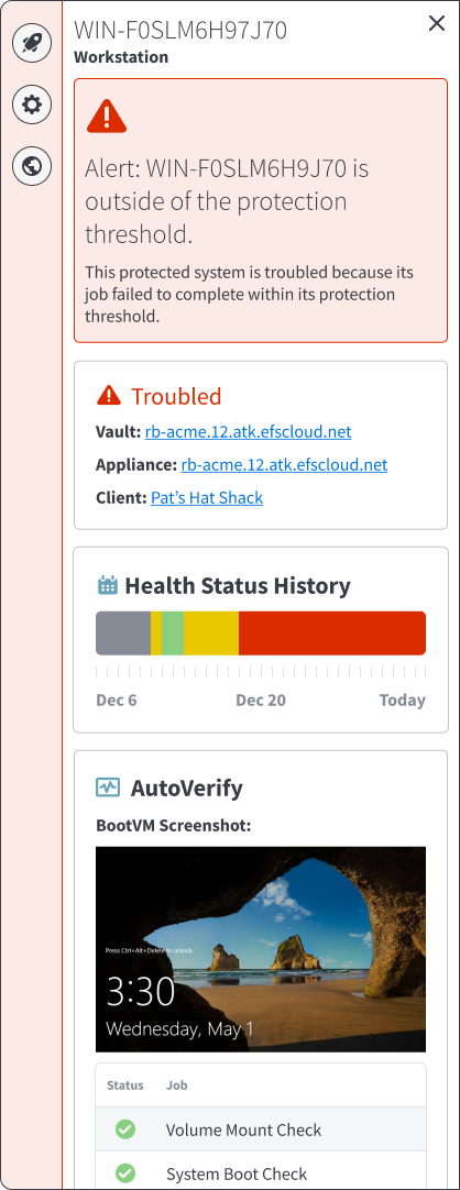
Alert: Provides a quick, detailed summary of why a device may be experiencing issues.
Device Overview: Maps device to vault, appliance, and client.
Health History: a visual overview of a device’s performance and stability over the past 30 days allowing users to quickly identify patterns or recurring problems.
AutoVerify: summarizes the most recent results for the protected system, including key validation checks and a BootVM screenshot to provide visual confirmation of system integrity.
Job History: a clear record of each job’s type, status, and completion timestamp to quickly review recent activity, identify failed or delayed jobs, and ensure that critical processes have completed successfully (item located outside of this frame)
Outcomes + Impact
A powerful sidebar bringing clarity, speed, and confidence to workflows
The interactive sidebar transformed how partners engage with our SaaS platform Dashboard by surfacing the right information at the right time. We eliminated unnecessary navigation, boosted engagement, and delivered a smarter, more intuitive experience.
125% Usage Increase
Partner engagement with key workflows on our Dashboard, indicating that the sidebar made features more discoverable and easier to act on.
95% Satisfaction Rate
Per our CSAT survey— citing improved clarity, reduced frustration, and better access to information.
27 Hours Saved/Week
Of page load time— saving entire teams hours of manual clicking, tabbing, and searching each week.
Interaction Design + User Interface
Sidebar Feature for Less Clicking, More Insights
UX Designer | November 2024 - March 2025


The Problem
Partners were losing efficiency due to fragmented information scattered across multiple tabs and screens. Without a centralized view, users were forced to context-switch repeatedly, slowing workflows and reducing confidence, especially for power users who needed to act quickly and accurately.
→
Reducing context switching by consolidating key insights into a single, accessible space
→
Surfacing just-in-time information to support faster decision-making
→
Providing shortcuts and next steps to streamline high-frequency workflows
→
Improving clarity and trust by presenting data in a consistent, intuitive format
How do we improve efficiency and surface contextual insights?
To improve efficiency and deliver contextual insights in the moment, we established clear design requirements grounded in user interviews, support data, and workflow mapping. These insights shaped a flexible sidebar pattern validated through usability testing and refined in partnership with engineering—ensuring real-time, high-value information is surfaced without disrupting users’ flow.
Define a sidebar experience that surfaces just-in-time insights
Deliver just-in-time insights, recent activity, and next-step actions directly within the dashboard—reducing navigation friction and improving decision speed.
Address known context gaps
Synthesize insights from user interviews and support data to define the highest-value information and actions to expose in-line.
Support diverse workflows with flexible patterns
Map end-to-end user journeys and establish scalable interaction models through wireframes and prototypes exploring multiple layout options
Ensure clarity, responsiveness, and performance
Validate comprehension and hierarchy through usability testing, and partner with engineering to support responsive behavior and dynamic content loading.
Watch the side bar in action 👇🏼
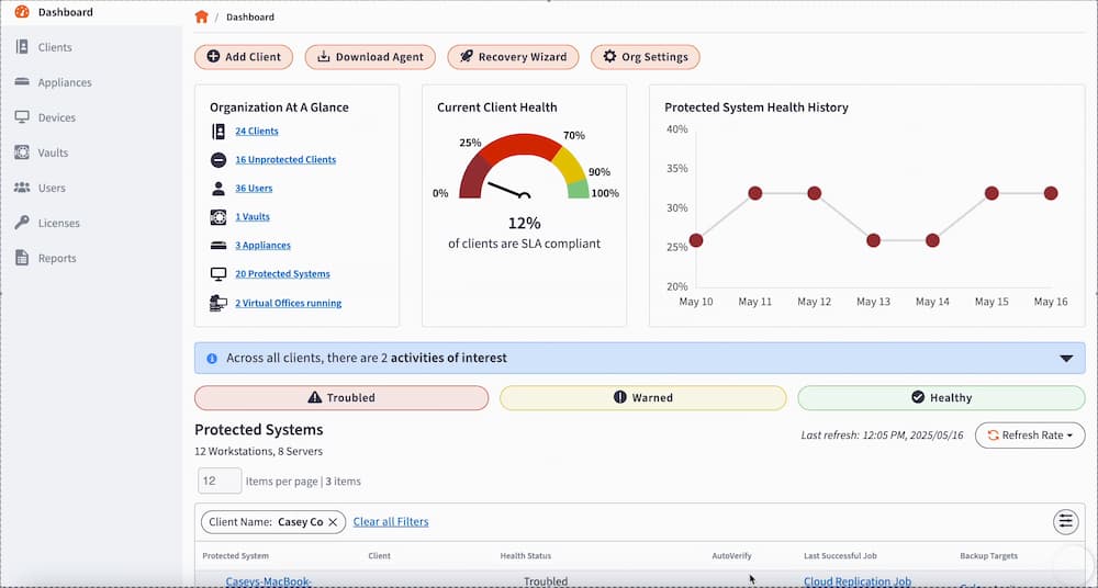
This demo shows how the sidebar surfaces contextual insights and quick actions in one place, helping users work more efficiently without navigating away from their dashboard.
In this example, you’ll see the user on the main Dashboard where they monitor devices. From here they click into a system and check the status of a job. They then check in on another system and read the alert.
Design Breakdown
Our solution consolidates related information and actions into a single, easily accessible view—without overwhelming the interface. We aimed to reduce context switching, improve task efficiency, and enhance overall usability, especially for users who rely on speed and focus in high-stakes workflows.
Alert: Provides a quick, detailed summary of why a device may be experiencing issues.
Device Overview: Maps device to vault, appliance, and client.
Health History: a visual overview of a device’s performance and stability over the past 30 days allowing users to quickly identify patterns or recurring problems.
AutoVerify: summarizes the most recent results for the protected system, including key validation checks and a BootVM screenshot to provide visual confirmation of system integrity.
Job History: a clear record of each job’s type, status, and completion timestamp to quickly review recent activity, identify failed or delayed jobs, and ensure that critical processes have completed successfully (item located outside of this frame)

Outcomes + Impact
A powerful sidebar bringing clarity, speed, and confidence to workflows
The interactive sidebar transformed how partners engage with our SaaS platform Dashboard by surfacing the right information at the right time. We eliminated unnecessary navigation, boosted engagement, and delivered a smarter, more intuitive experience.
125% Usage Increase
Partner engagement with key workflows on our Dashboard, indicating that the sidebar made features more discoverable and easier to act on.
95% Satisfaction Rate
Per our CSAT survey— citing improved clarity, reduced frustration, and better access to information.
27 Hours Saved/Week
Of page load time— saving entire teams hours of manual clicking, tabbing, and searching each week.
Interaction Design + User Interface
Sidebar Feature for Less Clicking, More Insights
UX Designer | November 2024 - March 2025


The Problem
Partners were losing efficiency due to fragmented information scattered across multiple tabs and screens. Without a centralized view, users were forced to context-switch repeatedly, slowing workflows and reducing confidence, especially for power users who needed to act quickly and accurately.
→
Reducing context switching by consolidating key insights into a single, accessible space
→
Surfacing just-in-time information to support faster decision-making
→
Providing shortcuts and next steps to streamline high-frequency workflows
→
Improving clarity and trust by presenting data in a consistent, intuitive format
How do we improve efficiency and surface contextual insights?
To improve efficiency and deliver contextual insights in the moment, we established clear design requirements grounded in user interviews, support data, and workflow mapping. These insights shaped a flexible sidebar pattern validated through usability testing and refined in partnership with engineering—ensuring real-time, high-value information is surfaced without disrupting users’ flow.
Define a sidebar experience that surfaces just-in-time insights
Deliver just-in-time insights, recent activity, and next-step actions directly within the dashboard—reducing navigation friction and improving decision speed.
Address known context gaps
Synthesize insights from user interviews and support data to define the highest-value information and actions to expose in-line.
Support diverse workflows with flexible patterns
Map end-to-end user journeys and establish scalable interaction models through wireframes and prototypes exploring multiple layout options
Ensure clarity, responsiveness, and performance
Validate comprehension and hierarchy through usability testing, and partner with engineering to support responsive behavior and dynamic content loading.
Watch the side bar in action 👇🏼
This demo shows how the sidebar surfaces contextual insights and quick actions in one place, helping users work more efficiently without navigating away from their dashboard.
In this example, you’ll see the user on the main Dashboard where they monitor devices. From here they click into a system and check the status of a job. They then check in on another system and read the alert.
Design Breakdown
Our solution consolidates related information and actions into a single, easily accessible view—without overwhelming the interface. We aimed to reduce context switching, improve task efficiency, and enhance overall usability, especially for users who rely on speed and focus in high-stakes workflows.

Alert: Provides a quick, detailed summary of why a device may be experiencing issues.
Device Overview: Maps device to vault, appliance, and client.
Health History: a visual overview of a device’s performance and stability over the past 30 days allowing users to quickly identify patterns or recurring problems.
AutoVerify: summarizes the most recent results for the protected system, including key validation checks and a BootVM screenshot to provide visual confirmation of system integrity.
Job History: a clear record of each job’s type, status, and completion timestamp to quickly review recent activity, identify failed or delayed jobs, and ensure that critical processes have completed successfully (item located outside of this frame)
Outcomes + Impact
A powerful sidebar bringing clarity, speed, and confidence to workflows
The interactive sidebar transformed how partners engage with our SaaS platform Dashboard by surfacing the right information at the right time. We eliminated unnecessary navigation, boosted engagement, and delivered a smarter, more intuitive experience.
125% Usage Increase
Partner engagement with key workflows on our Dashboard, indicating that the sidebar made features more discoverable and easier to act on.
95% Satisfaction Rate
Per our CSAT survey— citing improved clarity, reduced frustration, and better access to information.
27 Hours Saved/Week
Of page load time— saving entire teams hours of manual clicking, tabbing, and searching each week.